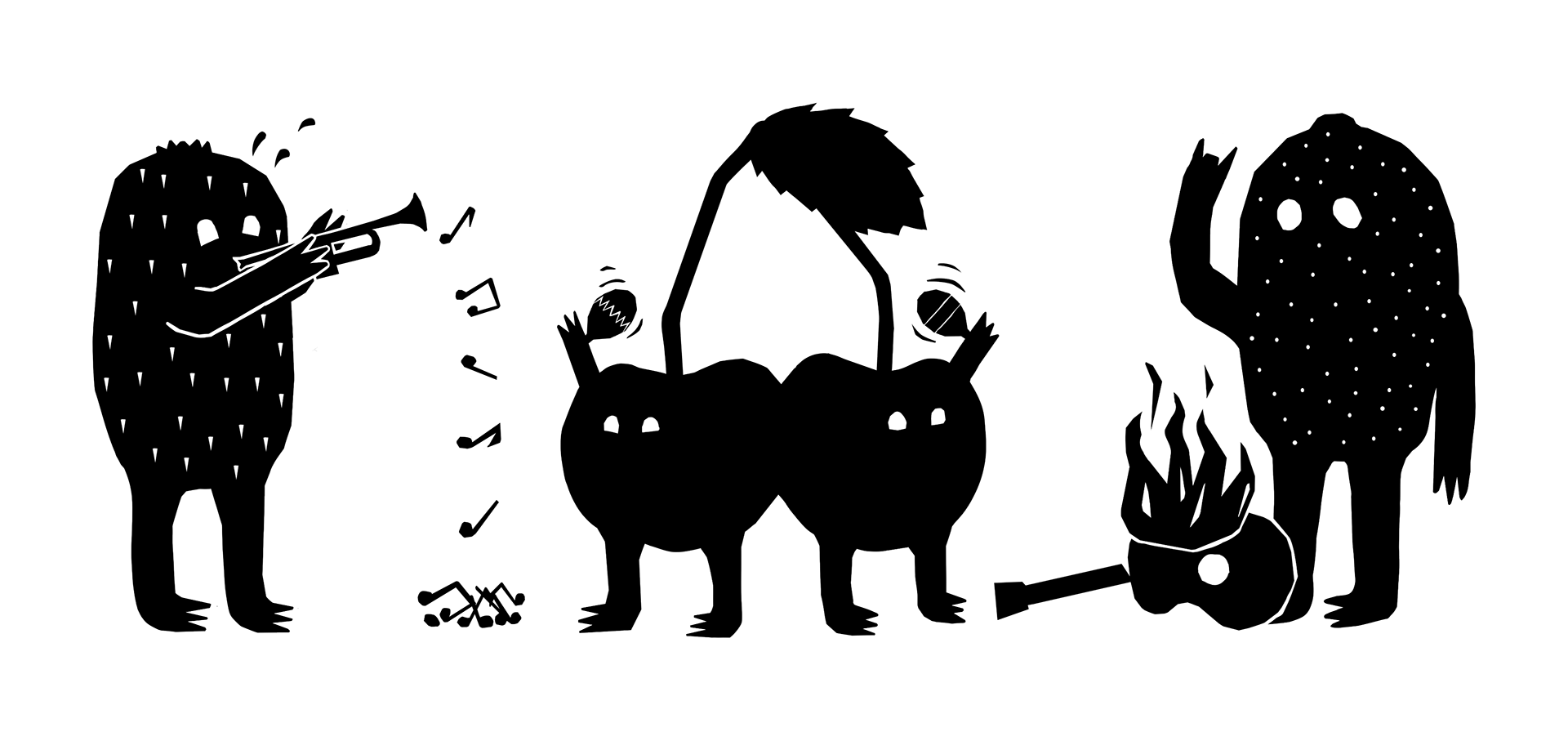
The playful illustrations of fruit playing musical instruments further connect the brand to the charitable cause it supports. They add personality to the brand, making the packaging more engaging and likable. The rough, cut-out style complements the otherwise minimalist brand identity.
The poster campaign playfully incorporates the theme of music, adapting well-known song titles to make a lasting impression on consumers. Bright colors, bold custom typography, and a prominent product image make the posters eye-catching and distinctive.
On social media, photos of chaotic breakfast scenes in a point-and-shoot style are paired with short, punchy headlines in bold custom typography. The youthful, alternative look sets the brand apart from other jam brands.
"Just Jam Bold" is a custom font. Its rounded shapes and elongated lines give it a friendly yet modern appearance.

The playful illustrations of fruit playing musical instruments further reinforce the brand’s connection to its charitable cause. They add personality to the brand, making the packaging more engaging and approachable. The rough, cut-out style complements the otherwise minimalist identity.
Thanks for taking a look.
Stay inspired! And have a great day!