Vienna is a cultural hotspot – every week there are hundreds of exhibitions, performances, concerts, and theater shows. But how do you keep track of everything in this cultural jungle? The (fictional) solution: Kultur Kompass, or Kuko for short. An app that sorts events by date or location and provides curated recommendations, ensuring you never miss out.
The minimalist color scheme is inspired by newspapers, ensuring that the app's color palette doesn’t clash with the colors of various events. Images of the different venues are adjusted with a black-and-white filter to match the app's visual identity, creating a cohesive look. In contrast, the images of the exhibition pieces are displayed in their original colors.
The social media campaign motivates followers to download the app by sharing information about new exhibitions and daily intriguing art facts.
The poster campaign stands out in the cityscape with bold, minimalist typography. The headlines play with various idioms and phrases. The recurring "Kuko, where..." phrase, combined with familiar or quirky sayings, helps the name stick in the minds of viewers and immediately connects it to the relevant theme.


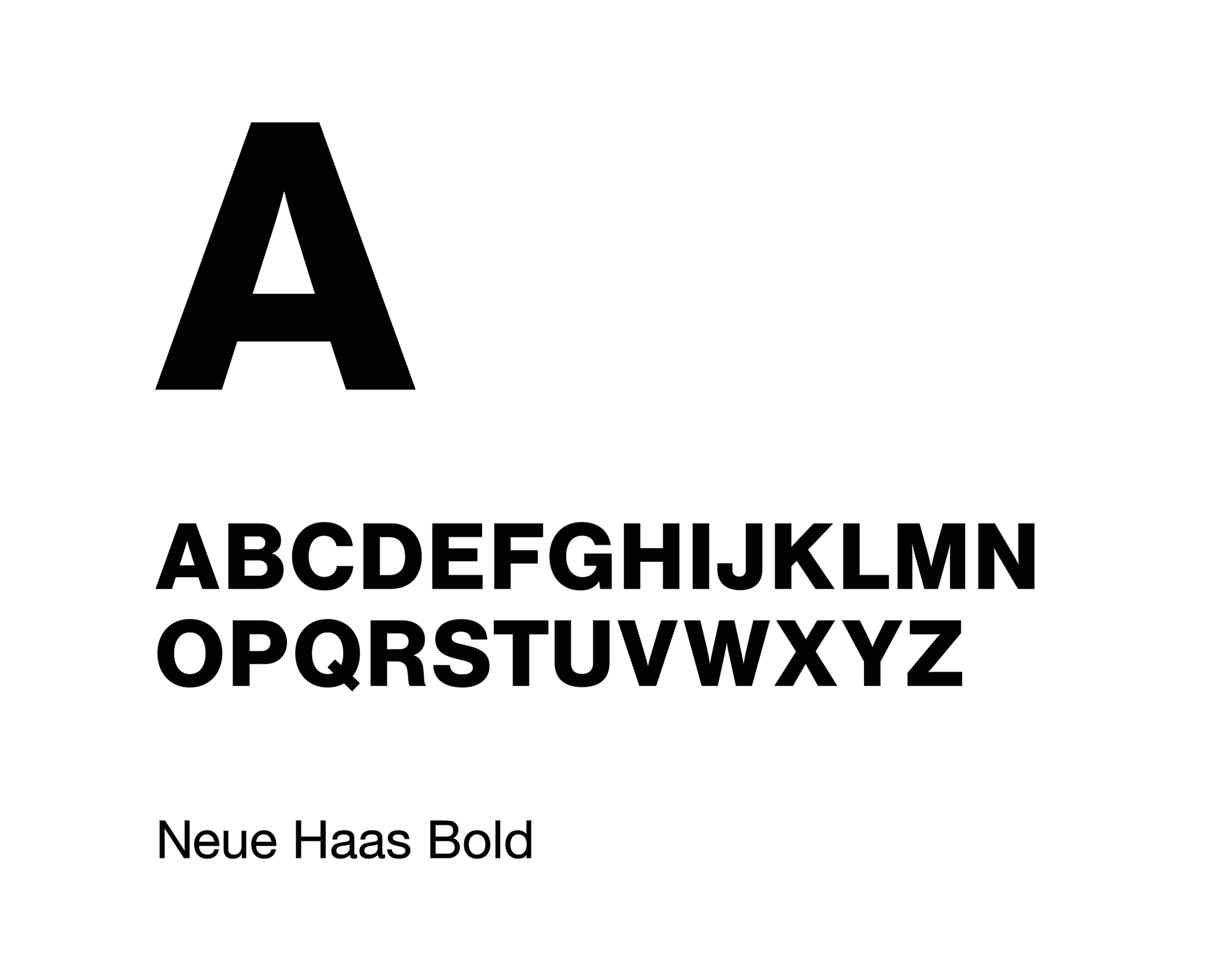
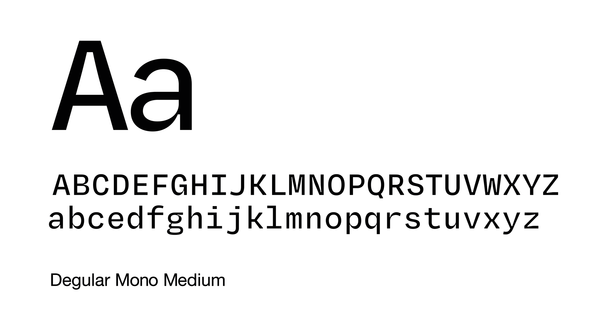
The Neue Haas font gives the identity a modern, professional look and provides a neutral foundation for the events. The Degular Mono font adds more character to the identity and remains highly legible even in small sizes, thanks to its large x-height.
The key visual is inspired by early depictions of the all-seeing eye.
The key visual is used as a recurring element of the identity in various situations, such as a "loading bar" or as a filler in social media posts or posters.
The key visual remains easily recognizable even in smaller sizes, such as an app icon.
Thanks for taking a look. Stay inspired!
Wishing you a wonderful day, cheers!
Wishing you a wonderful day, cheers!